Select Astro
Project Overview
SelectAstro( now Vama) is an app base solution for Astrology need. They also offers online Puja, Online Astrologer consultations, and special rituals and occasion based puja.
App run as pay per service and also offer their services on Progressive Web App.
Role
UX Research, UI Design
Platform
iOS & Android (Mobile-first)
Key Challenges
App will be serving user with wide range of age group and different demographics. Challenge was to make it interesting and usable for young user as well make it intuitive for aged user base. Primary users will be religious Hindu
VAMA is a digital spiritual platform that brings together online puja, chadhava, astrology consultations, temple experiences and spiritual content. The platform currently offers access to 550+ temples and 1,000+ astrologers, alongside services such as VAMA TV and VAMA Mall.
- Find and consult an astrologer
- Create Birth Charts
- Book a puja or chadhava
- Explore temples and spiritual services
- Access personalised astrology
- Watch spiritual content
- Discover spiritual products
The challenge was to make a large, content-heavy ecosystem feel simple, trustworthy and easy to navigate.
My focus
Reduce cognitive load while keeping the experience emotionally connected to the spiritual nature of the product.
Understanding the Product
I started by breaking the platform into its primary user journeys rather than designing individual screens in isolation.
Core Journey
Discover → Explore → Decide → Book → Complete
For Astrology
Need → Find astrologer → Compare → Consult → Continue
Information Architecture
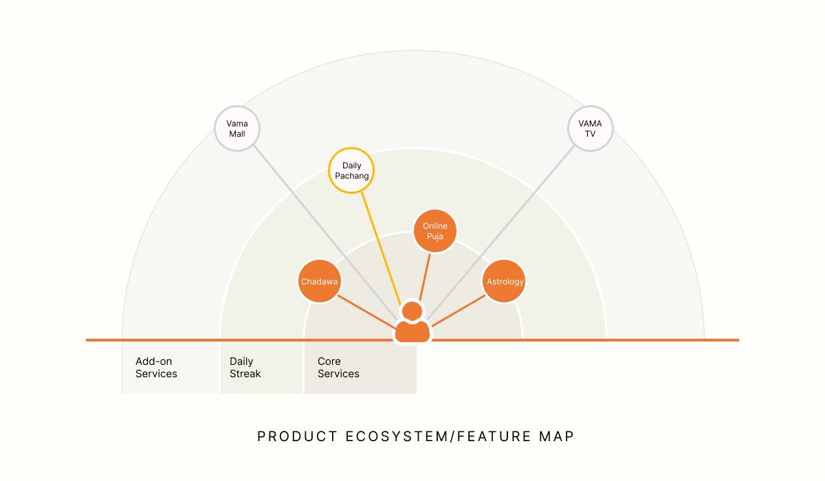
The biggest UX challenge was content hierarchy. Instead of treating every service equally, I grouped experiences around user intent.
- Puja — discover and book rituals
- Chadhava — make offerings remotely
- Astrology — find and consult astrologers
- TV — consume spiritual content
- Mall — discover spiritual products
- Panchang — access daily spiritual information
The structure was designed to let users reach their primary task quickly without feeling overwhelmed by the breadth of the platform.
User Flow
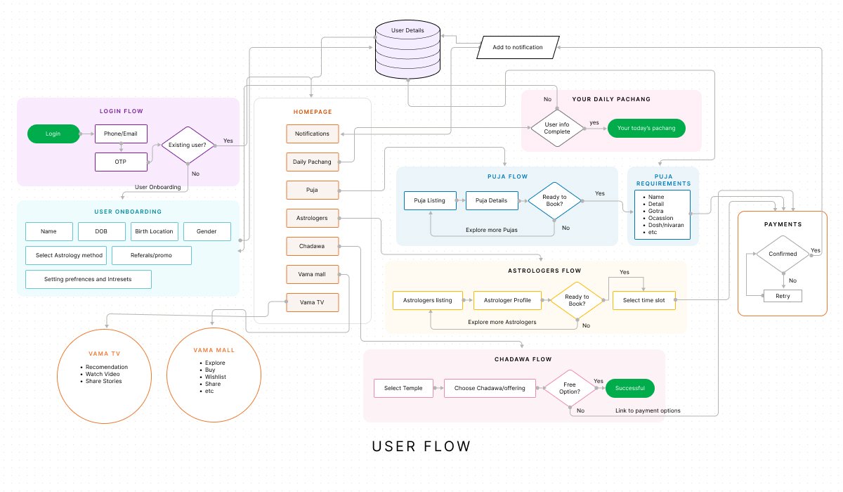
Before moving into visual design, I mapped the important flows
Example: Booking a Puja
Home → Puja → Temple → Puja details → Personal details → Payment → Confirmation
The flow was designed around one question at every stage:
What does the user need to know before taking the next step?
This helped keep information progressive instead of presenting everything at once.
Wireframes
translated the journeys into low-fidelity wireframes before introducing visual styling.
The objective was to test:
- Content hierarchy
- Navigation
- Information density
- CTA placement
- Card structures
- Booking flow
- Discovery patterns
At this stage, visual decoration was intentionally kept minimal so the UX could be evaluated independently.
Designing Trust
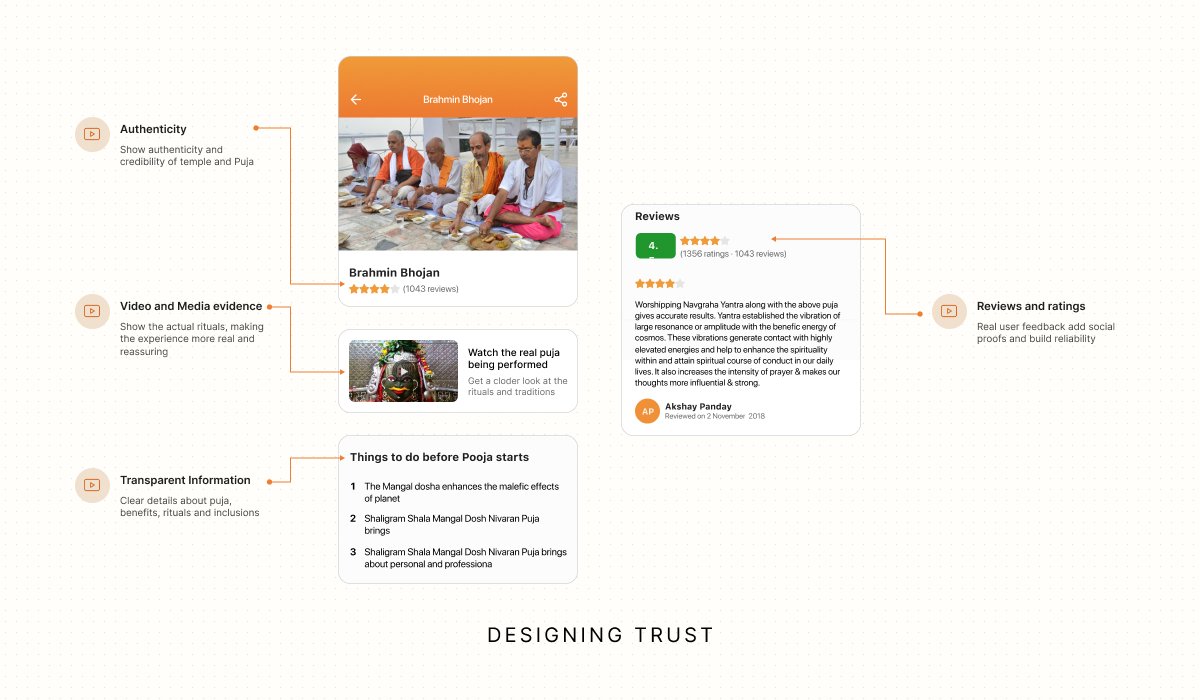
Spiritual services involve a highly personal decision: the user needs to feel confident before making a booking or consultation.
I therefore treated trust as a UX element, not simply a visual style.
Design considerations
- Clear service information
- Visible astrologer/temple information
- Strong hierarchy around important details
- Transparent booking steps
- Relevant proof and supporting information
- Clear CTAs at decision points
The current product communicates elements such as verified temples, astrologer availability, personalised puja details, puja videos and prasad delivery.
Visual Design
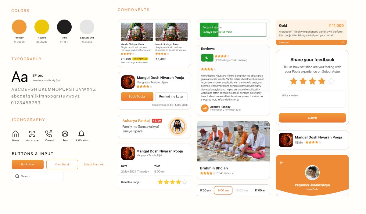
Once the structure was established, I developed the visual language around the emotional character of the product.
Design direction
- Warm and spiritual
- Premium but approachable
- Rich imagery
- Strong typography
- Clear content hierarchy
- Generous use of cards and visual sections
- Consistent iconography
- Strong emphasis on imagery for temples and spiritual experiences
The goal was to avoid making the product feel like a traditional religious directory or an overly decorative spiritual app.
Instead, the interface combines modern digital-product patterns with a culturally familiar visual language.
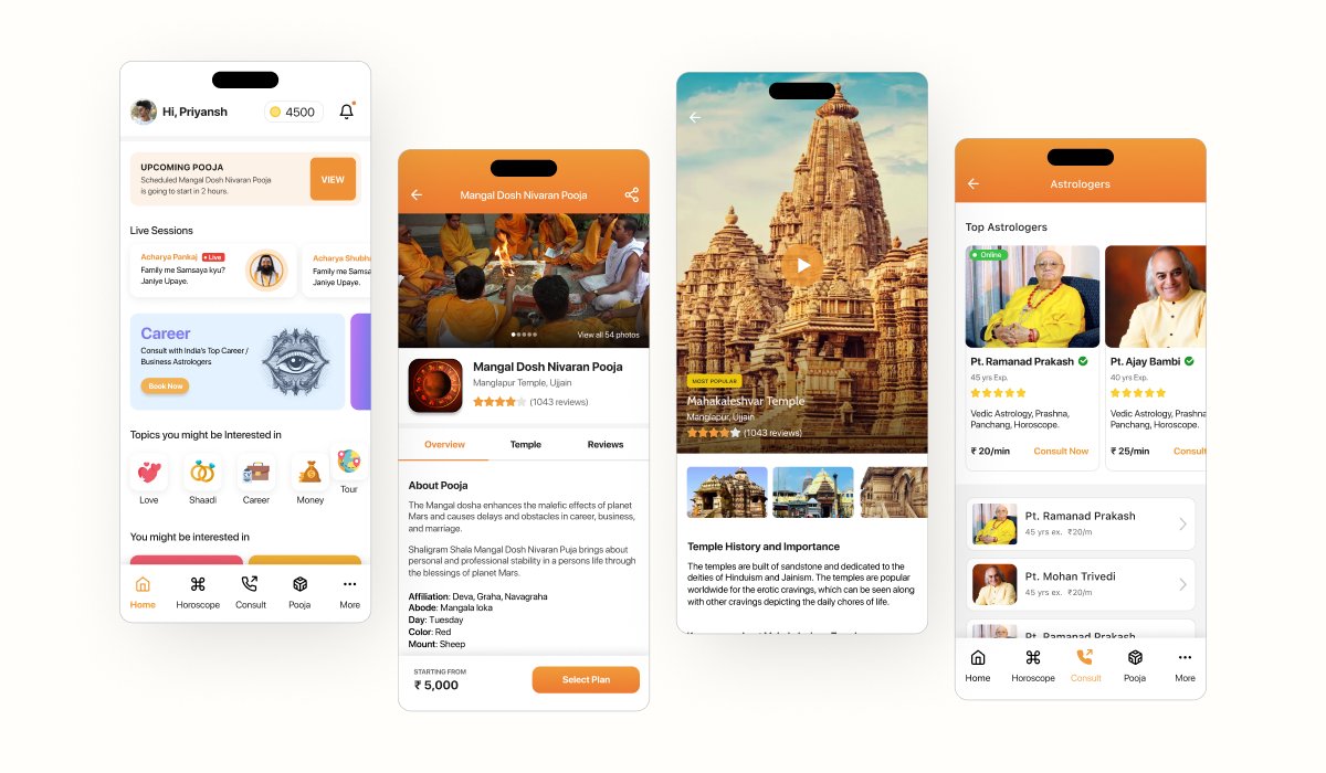
Designing the Core Screens
I then expanded the design system across the major experiences.
Home
Designed as a discovery layer that quickly exposes the major services while allowing users to explore deeper.
Puja
Focused on helping users understand the ritual, temple, benefits/information, pricing and booking action before committing.
Astrology
Designed around discovery and comparison—helping users find an astrologer based on relevant information before starting a consultation.
Personalisation
Important user information such as name, gotra and manokamna becomes part of the puja experience, reflecting the personalised nature of the service.
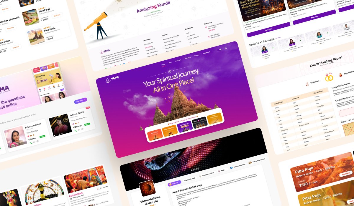
Website Experience
The website was designed as an extension of the product ecosystem rather than a completely separate visual language.
The objective was to:
- Communicate the value proposition quickly
- Introduce the major services
- Build credibility
- Guide users toward app/service conversion
- Create a consistent VAMA brand experience across web and mobile
From UX to Final UI
The final process looked like:
Understand → Structure → Flow → Wireframe → Test → Visual System → UI → Responsive → Refine
Rather than starting with screens, I started with the user’s reason for being on the platform.
That helped me design VAMA as an ecosystem of connected experiences instead of a collection of individual screens.
Final Product
The resulting experience brings multiple services like puja, chadhava, astrology, spiritual content and products—into a unified digital ecosystem. The current VAMA product continues to position these as its core experiences.
My contribution
- UX strategy
- Information architecture
- User flows
- Wireframing
- UI design
- Design system
- Mobile app design
- Responsive web design
- Interaction patterns
- Conversion-focused experience design